Pellone Pizzeria Menu
programs used:
adobe illustrator, adobe photoshop, adobe indesign
project type:
educational
year completed:
2018
This project was part of a university assignment, I was to take a preexisting menu and redesign it. I remembered one of my favorite restaurants I have ever been to was Pellone's Pizzeria. I remember it was common knowledge among all of my colleagues in Italy that Napoli had the best pizza. I was skeptical when I went to the restaurant, but their diavola (pepperoni pizza) was the best I had in all of Italy. It was kind of crazy how flavorful and delicious the food was. I do remember their menu was quite bad though; it looked like it had been xerox copied at least a dozen times and designed in a basic document software. The menu was also bound in this weird plastic binder. I decided I would remake Pellone's menu and emailed the owner, he gave me some copies of their menu along with edits he was planning on making to the contents of the menu.
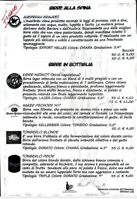
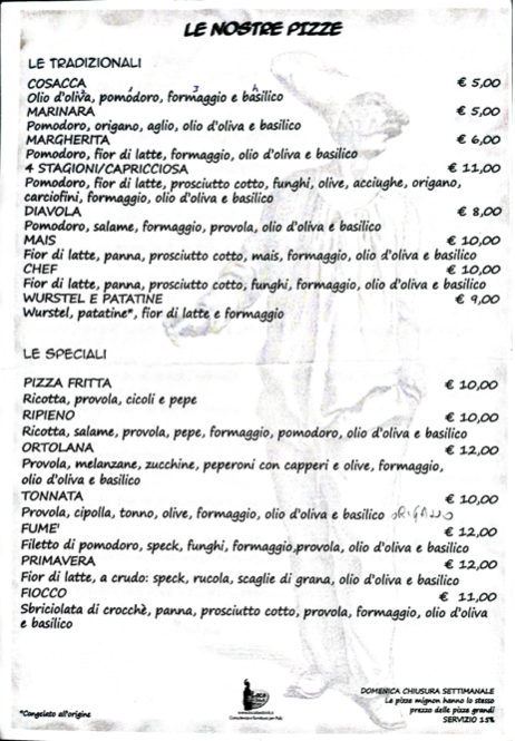
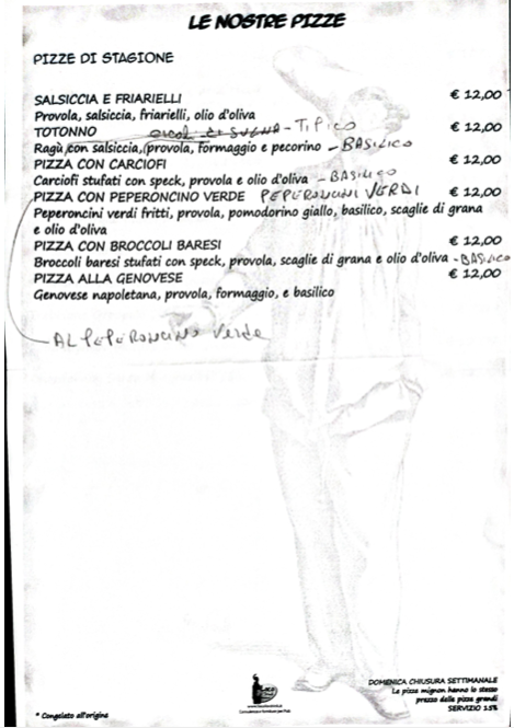
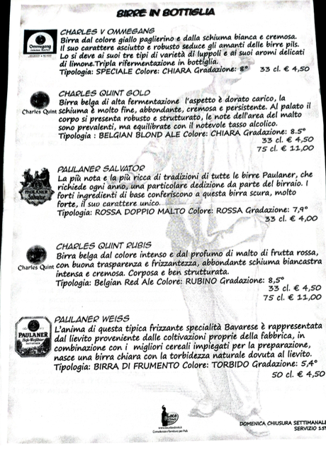
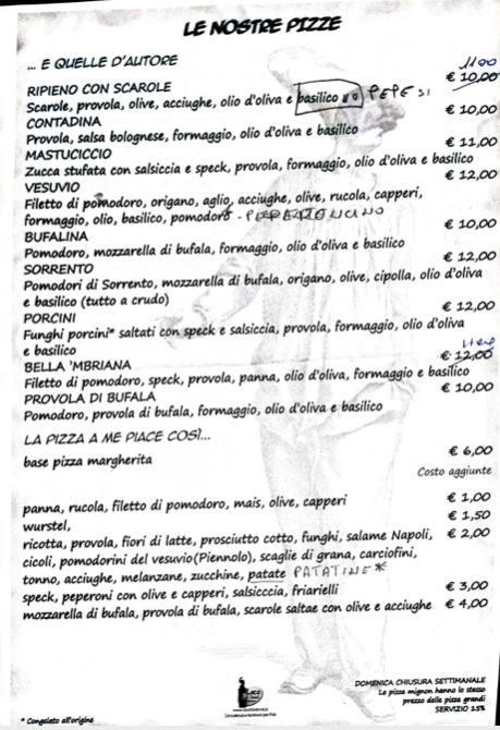
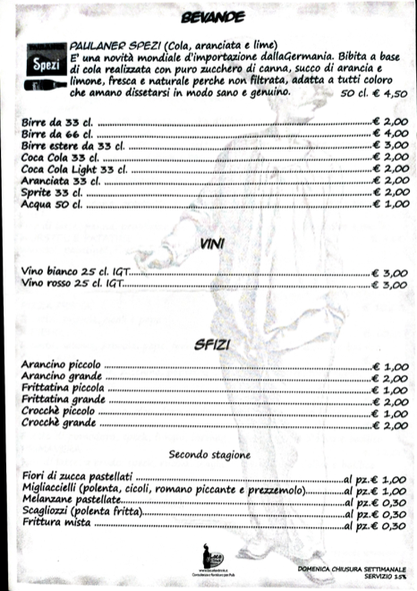
This is the original menu that I interacted with a plastic binder. The categories were not grouped together and there were hand written edits scanned into the menu. Most of the logos in the menu were beyond repair and were not readily available on the internet. Even the logo for the restaurant could not be found by the owner. I put a lot of time into reworking and constructing all of the logos in the menu.
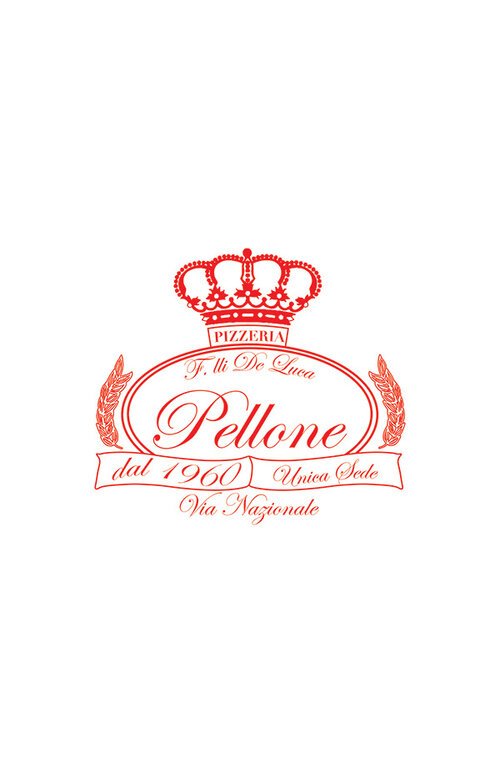
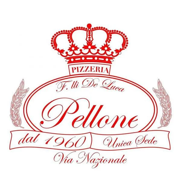
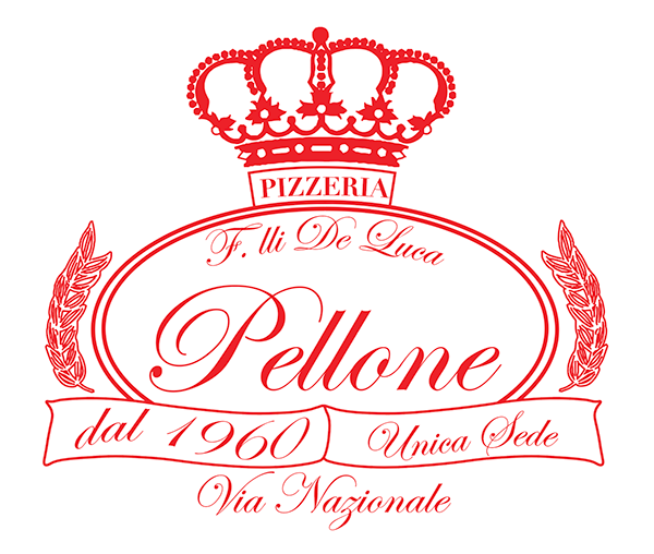
The old logo looked like it had been exported and copied many times as a raster file. The poor maintenance of the logo resulted in damages like the cut-off of the right side of the “e” and the bottom of the “z'“ The entire logo had fuzzy edges and was losing vibrancy. The laurels were beginning to fade.
In order to revitalize the logo I found the font and redid everything in vector so it could easily be edited and sized. The ovals, banners, and box are all line art; but the laurels and crown were drawn by me in ink and then vectorized, I think if I were to do it again I would make those out of line art in Illustrator also.
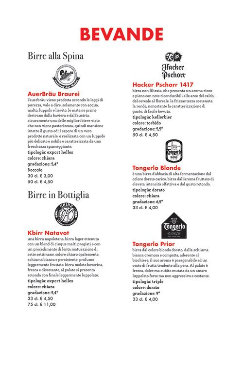
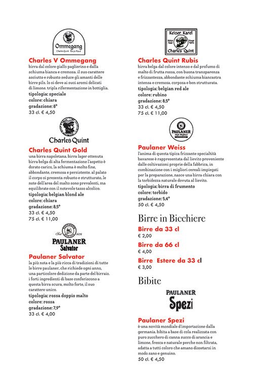
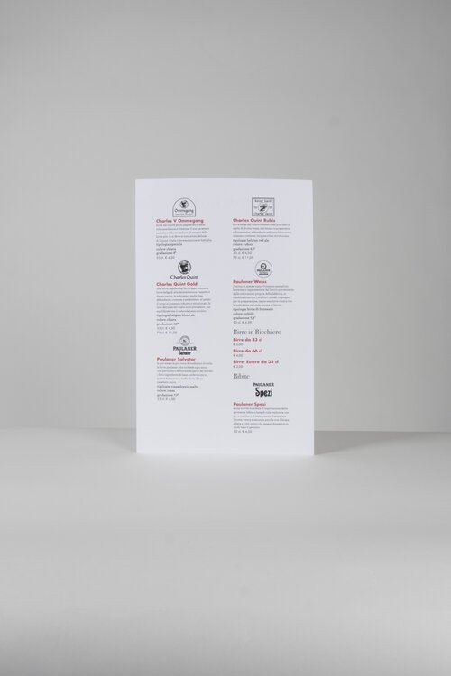
In the original menu, many of the beers had logos or labels displayed; but the quality of those assets was abysmal. The owner wanted the new menu to also include these assets.
I set to work recreating even more logos. Most of the drinks came from smaller organizations that did not reply to me and did not have accessible brand assets. So I did my best to create black and white assets. Luckily they were to be printed very small so small imperfections wouldn’t be too visible, but I definitely feel what I produced looked more clean and professional than the disaster punk xerox aesthetic of the original.
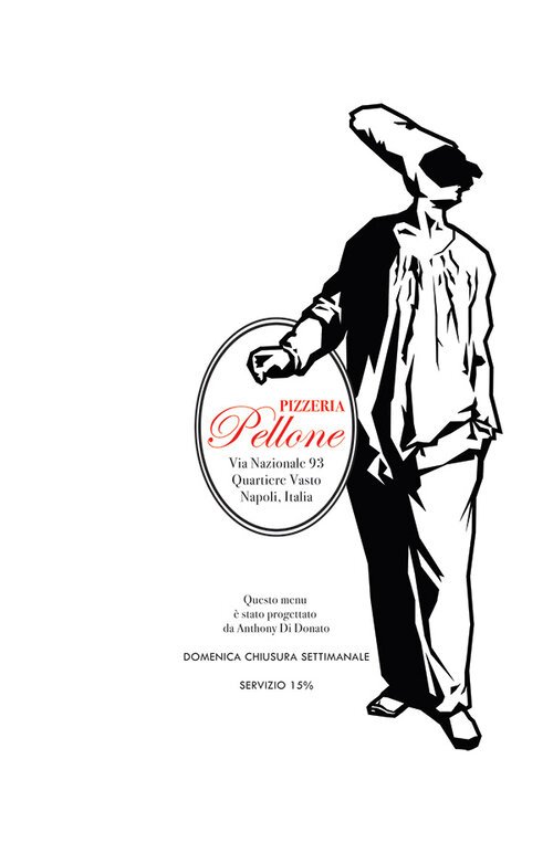
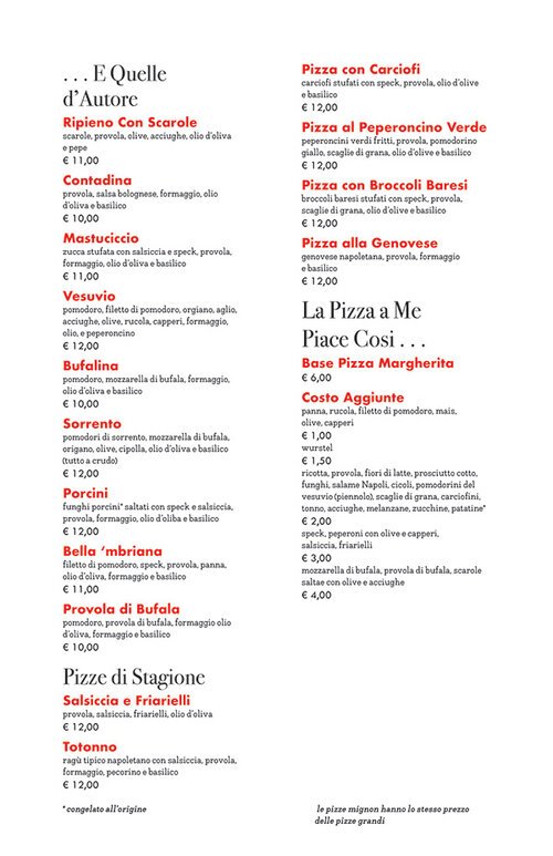
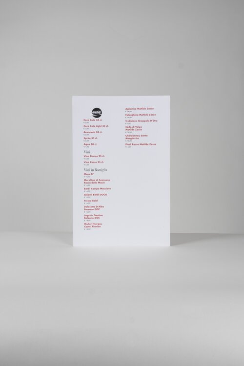
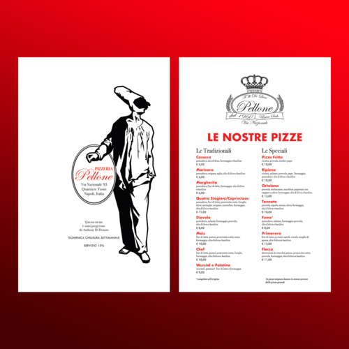
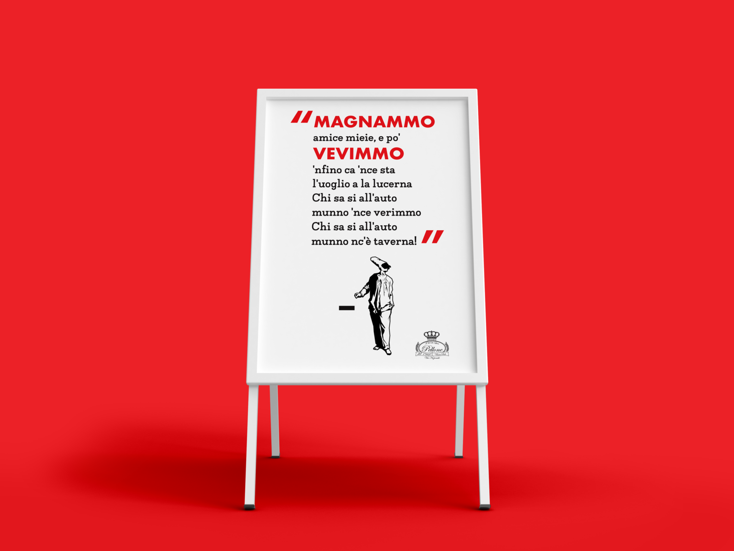
I prioritized professionalism and readability in my rendition of the menu. I wanted to have a strong visual hierarchy, so a lot of thought was put into the typography. I’m very happy with what I created and am proud of the project. In retrospect, I would’ve given more space to the logos and headers and I would’ve put the menu in a red leather binder as I had originally imagined (I didn’t have much money to spare for the project at the time). I included an illustration of Pulcinella, a sort of symbol very common among all of the pizzerias in Campania. Pulcinella is the masked character in a sort of jester/cook outfit and is a common symbol in Napoli and was even faintly visible in the original menu.
I emailed the owner and sent my design to him. I asked if he liked it and wanted to use it. I never heard from him again. I figure he was worried about paying for it. If you’ve ever been; you know that Campania (especially Napoli) is a very broken naughty place, but that is part of what makes it so magical. I like to think my menus or something inspired by them sit on the tables of Pellone’s.
